

Features Industry Profiles
July 1, 2011 •
Cheree Berry
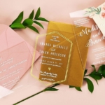
Although our industry is driven by trends, true visionaries have the inner confidence to ignore them and follow their own muse. Even the quickest review of the dynamic designs created by Cheree Berry reveals her individual brand of whimsy, articulated through hidden envelope details, unexpected paper dimensions, foil touches and vintage wallpaper inspirations.
This distinctive quality has garnered the St. Louis, Mo., designer a lot of media attention – from creating Chelsea Clinton’s bridal invitation trousseau, to multiple TV appearances, to having her own 2008 wedding profiled in “Martha Stewart Weddings.”
If her designs speak to today’s trends, it’s unintentional, Cheree noted. “Our clients strive to have unique, one-of-a-kind events, so going against trends is usually where they want to be when it comes to their stationery.”
Stationery Trends interviewed Cheree, CEO and founder of Cheree Berry Paper, to learn more about her background and vision.
Background & Beginnings
ST: Is Cheree Berry your given name?
CB: Yes, it’s always butchered! In fact, I was on a nationally syndicated morning talk show recently and the hostess called me “SHERRY BERRY!” But, having said that, you can’t really blame her. My mom, a retired French teacher, wanted to name one of her daughters a French name … guess who was chosen?
ST: For your thesis while earning a B.F.A. at Washington University in St. Louis, you created a pop-up book called “Hoorah for the Bra,” eventually published by Stewart, Tabori and Chang. Were there parameters you created it around? How did you come up with it?
CB: The parameters were completely open. Since my interest was in print design and I had a childhood obsession with pop-up greeting cards, I decided to write and design a pop-up book. As for the topic, I’ve always had a love/hate relationship with bra shopping. As I began researching the brassiere’s history, I was amazed by its fascinating but seldom told story. And bras and pop-up books strive to do the same thing – pop up and out!
ST: What was it like to work at both the legendary Pentagram agency and then at kate spade?
CB: My first job after graduation was as a junior designer at Pentagram, a dream come true. During my time there, I just tried to keep my head above water and not take for granted the amazing design icons I was rubbing elbows with at the water cooler. I thought I had used my only luck card (there), but life handed me one more when I was offered a design position at kate spade. I started as a designer and worked my way up to senior art director. I worked on everything from lookbooks to press invitations to the kate spade & Crane stationery line. It doesn’t get much better than that.
ST: What was it about the kate spade experience that inspired you to start your own line?
CB: I learned that there are many different brides out there – traditional, modern, whimsical, romantic. It’s challenging and exciting to design for so many different types of couples.
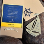
ST: You were the featured stationery designer for NBC’s 2007 “Today Throws a Martha Stewart Wedding,” in which a couple wed on the air and had their reception at Tiffany & Co. How did the final product befit the event?
CB: This was no ordinary event, so it needed an equally unique invite to match. I went for a timeless design with a WOW factor – a triple layered invitation with all three layers edged in Tiffany blue. For typography, I chose three fonts to mimic vintage Tiffany’s receipts and printed material. On the shoulder of the envelope, we typeset the smallest bit of type, “A Most Wonderful Occasion,” which mirrors an inscription on the interior of a wedding band. Lastly, to tie in that classic Tiffany & Co. blue box, a tiny Tiffany blue reception card was tucked into a mini envelope, a CBP signature.
The Business of Paper
ST: Your work is distinguished by a sense of surprise. What tend to be your biggest inspirations in creating these offbeat visions?
CB: I credit the whimsy in my line to having a colorful, fun childhood. My mom was always throwing surprise parties for my sisters and I. I have always loved surprises and gag toys and those “made you look” moments. I avoid the fussy and the contrived, but try to put a sophisticated spin on our designs.
ST: Does running a paper line differ from how you envisioned it?
CB: When I started my business, I wasn’t your typical entrepreneur. I didn’t think three months, let alone five years out. Therefore, I didn’t really have a concrete vision. Hard work and energy gave me the fuel to get started but there were many things I learned along the way. Who knew black envelopes could bleed when traveling in the mail or that there were so many ways to word an invitation?
ST: Can you describe a typical day?
CB: No two are alike. But most consist of: going down the “hot list” to keep track of what needs to go out that day and reviewing client timelines, peeking at blogs, briefing the designers on new projects, packing and shipping client jobs, digging into the candy jar to fish out a mini Twix, taking a client call or two and checking color proofs.
ST: What advice would you give new invitation designers?
CB: I think success is a mix of hard work, talent and luck. If you have at least two of those things, three preferred, you’re most likely to succeed. If designing stationery, meeting potential clients and being inspired by the visual world around you is fun and doesn’t feel like work, you’re probably going to be good at what you’re doing.
ST: What consumer, lifestyle or industry trends do you find interesting?
CB: We’re influenced every day by the world around us. I’m inspired by Tina Fey’s humor, the J.Crew catalog and Jessica Hische’s daily drop caps.
ST: Do you focus more on the creative side or business side?
CB: Definitely the creative side! I feel lucky to have found a great COO, Kristen Armstrong – a former client actually – who does an amazing job handling the business operations.
ST: Are there any other upcoming products or projects you have in the works that you can share?
CB: We’re in the process of a big website redesign. It will be up by end of year. And we have some exciting weddings in the works so stay tuned.
ST: Any other stationery designers or companies you admire?
CB: I’m a long time admirer of Nancy Sharon Collins’ work. It’s smart, sophisticated and simple. I’ll also, naturally, be forever-in-love with the kate spade stationery line. Their “small card, big thank you” notecard is my favorite thank you note of all time.

Cheree at a Glance
Q. If you could travel through time and space and land anywhere you desire, where and when would it be?
A. I would go back to 1893 to visit the Chicago World’s Fair. The transformation of the city and the structures that were built in such a short time is beyond belief. I would be one of the first to ride the Ferris Wheel and chew a stick of Juicy Fruit.
Q. Do you collect anything?
A. I’m not a big collector. I had a killer Garbage Pail Kids trading card collection when I was younger. My older sister had a vintage stamp collection. At the time, I thought her hobby was totally lame, but I’m a little envious now, as I’m always hunting for vintage stamps to use on my invitations.
Q. How would you define your signature style?
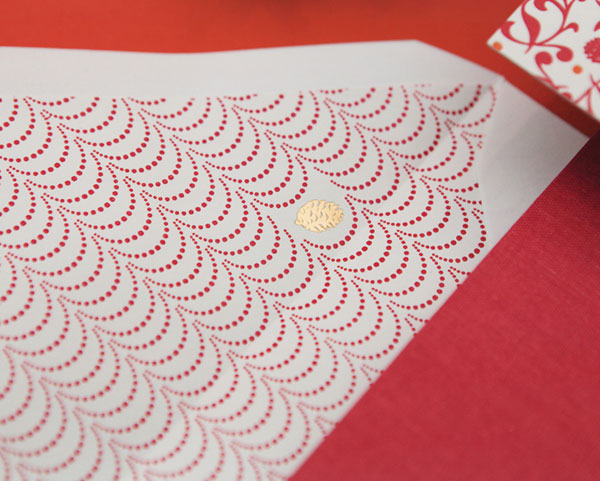
A. Our signature style is definitely the unexpected and chock full of surprises. I think my own wedding invitation epitomizes our signature look. A few details include printing on the shoulder of the inner envelope, a hidden detail in the envelope liner, a design on the invitation backer, accents of gold foil, reception envelope within an envelope, mix of prints, expressive type, vintage stamps and calligraphy touches.
Q. What’s new for 2011?
A. We have a ton of new designs. When our website launches, you’ll find about 50 designs in our collection, about 30 of them new additions.
Q. What one design or product from your 2011 releases do you think is really going to be hot?
A. I love the interactive pull-out tabs we’ve introduced in our inner envelopes. We have also been nestling little icons in the stationery designs that represent our clients. It’s really subtle but it’s a clever, delicate way to brand your stationery. We (also) hid golf clubs in the ornamental border on one client’s invite, both avid golfers.
Q. What other designers, music and movies inspire you?
A. Creatives: Tim Burton, Cipe Pineles, Tibor Kalman, Paul Rand, Lulu De Kwiatkowski.
Q. If you couldn’t do this, what would you do instead?
A. I would run a winery … smashing the grapes, tasting the wine and designing the labels.